Articles | June 7, 2021 | 5 min read
What Makes a Great Email Newsletter?
Here’s a stat you can’t ignore: 60% of U.S. adults subscribe to an email newsletter. This vast reach makes email newsletters one of the most opportunistic forms of marketing (especially since people voluntarily opt-in to read your content). But how can you ensure your content resonates with your audience and keeps them from unsubscribing? Or, even worse, marking your email as spam? In this blog, we’ll explore what makes a great email newsletter so you can keep your subscribers happy and engaged.
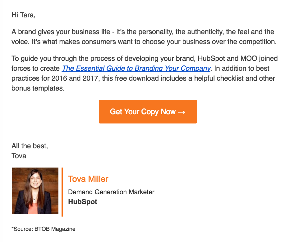
Despite its basic designs (plaint text, one hyperlink, and CTA button), Hubspot’s email newsletters stand out because of one striking element—they include a real sender name. Using a human face gives your emails a personal touch that immediately draws readers in. In fact, it’s probably where they’ll look first before reading the body copy. Human faces are also great for advocating a solution or giving a testimonial as they bring a level of credibility.
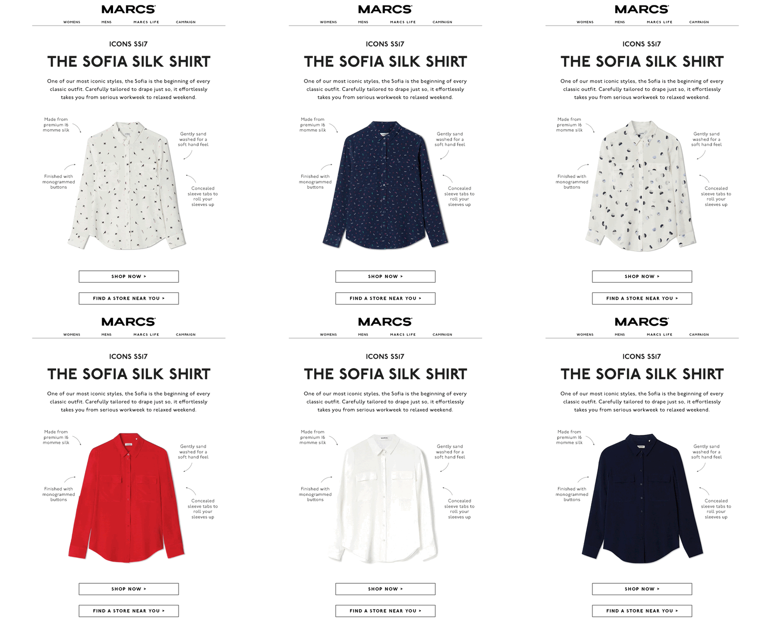
Emojis and GIFS are a simple way to bring personality to your email newsletter and stand out in a crowded inbox. Not only do they bring diversity to the design, but can also enrich the user experience, reinforce a message, and increase click-through rates. Adding emojis and GIFs to an email newsletter is simple with the right marketing automation tool, and their universal meaning makes them perfect for a wide variety of audiences. The below example from Marcs’ email newsletter uses a simple animated GIF to demonstrate a range of styles without asking readers to scroll.
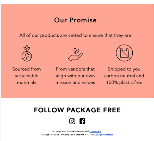
Including links to social media accounts and website pages is a great way to create additional touchpoints with your audience. Implement social links at the bottom of your newsletter and/or in-line with your content. Linking to a specific landing page (e.g. blog, website homepage, etc.) a support email address, or flagship address also helps drive more traffic to your website and other brand pages.
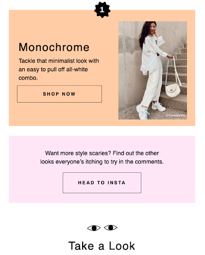
ThredUP does a great job of displaying its social media accounts at the bottom of each newsletter. They also try to incorporate a unique CTA in the body of the email encouraging subscribers to go to their Instagram for more style inspiration.
A newsletter can easily feel cluttered. The trick to making your email newsletter look decluttered depends on two things: enough white space and concise copy. White space is key in email newsletters as it helps visually alleviate the feeling of clutter (and makes reading on mobile much easier). Concise copy is important so that your subscriber doesn’t have to dig for the information they’re looking for. Moreover, you want the reader to have only a small taste of your content so that there’s a desire to click and read or learn more.
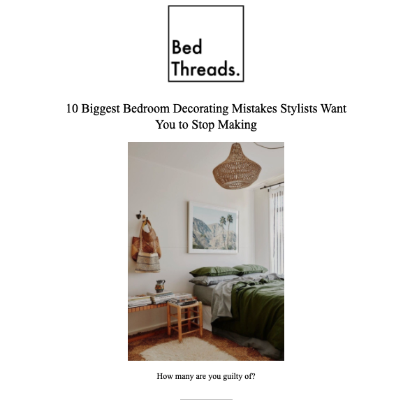
Bed Threads’ email newsletters feature a minimal design with adequate whitespace and short copy descriptions.
Although keeping copy minimal is best practice for email newsletters, sometimes you have a lot to say. When that’s the case, be sure to structure information in an easily digestible way. Use dividers and design elements to split your email into a few solid chunks that are reader-friendly as well as aesthetically pleasing. In short, you can’t expect your subscribers to hold more than a few pieces of information in their short-term memory at once.
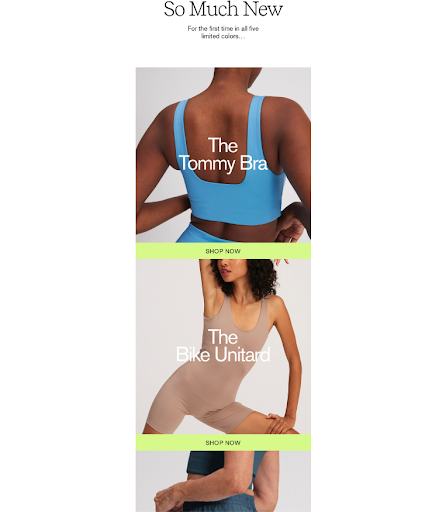
Instead of creating dividers with white space, Girlfriend Collective takes a different approach by using a “Shop Now” CTA as its dividers, which link to each product on its website.
A brand is a combination of elements, and the visual elements of an email newsletter should reflect your branding (logos, colors, fonts, etc.). Often, we can recognize a logo or a typeface of a company even if we have no idea what that brand or company does. That’s the magic of building a brand using the right design elements. Dropping subtle hints of your brand elements into your newsletters will help spark brand recognition and give your content a more familiar, consistent feel.
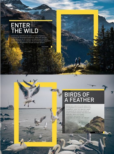
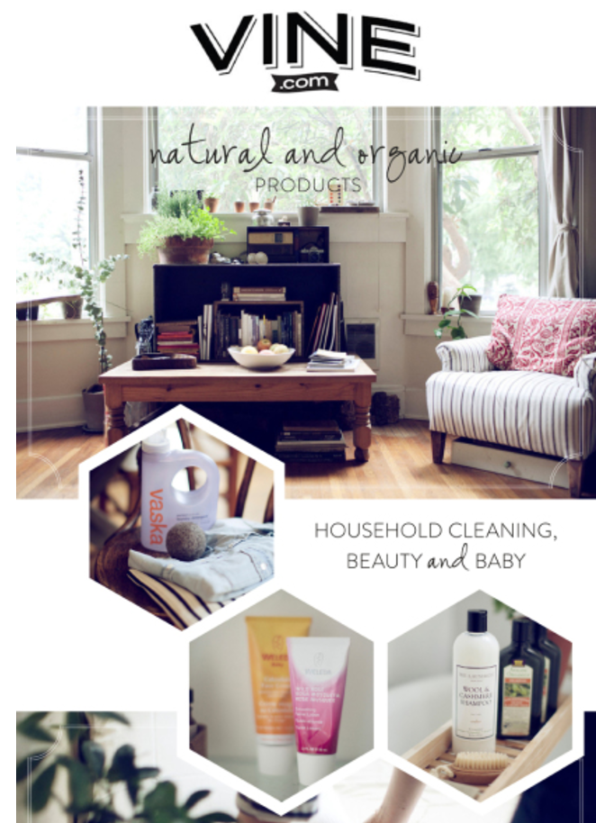
There are plenty of email newsletters out there using the same standard layout of text-image or image-text alternations. Break from this traditional style to immediately grab your audience’s attention. This can be done simply by alternating between sizes and shapes in your newsletter design to break the monotony of reading. This email by Vine.com breaks the standard text-image format by bringing in hexagons to place emphasis on certain products.
Unsubscribe links are among the many email newsletter best practices that should be implemented. Although it may seem counter-intuitive, unsubscribe links are a way to maintain an active, engaged subscriber list. Be clear with your language (e.g. “Unsubscribe Now” versus “alter your communication with us” and don’t hide an unsubscribe button behind an image without alt text.
Aside from keeping your subscriber list healthy, having a clear unsubscribe process helps you avoid having your email marked as spam.
Read some of our latest blog content on the subject:
5 Great Ideas for an Unsubscribe Email
7 Tips and 7 Tactics for Writing Engaging Email Subject Lines
Sender name
Despite its basic designs (plaint text, one hyperlink, and CTA button), Hubspot’s email newsletters stand out because of one striking element—they include a real sender name. Using a human face gives your emails a personal touch that immediately draws readers in. In fact, it’s probably where they’ll look first before reading the body copy. Human faces are also great for advocating a solution or giving a testimonial as they bring a level of credibility.

Emojis and GIFs
Emojis and GIFS are a simple way to bring personality to your email newsletter and stand out in a crowded inbox. Not only do they bring diversity to the design, but can also enrich the user experience, reinforce a message, and increase click-through rates. Adding emojis and GIFs to an email newsletter is simple with the right marketing automation tool, and their universal meaning makes them perfect for a wide variety of audiences. The below example from Marcs’ email newsletter uses a simple animated GIF to demonstrate a range of styles without asking readers to scroll.
Social media integration and additional links
Including links to social media accounts and website pages is a great way to create additional touchpoints with your audience. Implement social links at the bottom of your newsletter and/or in-line with your content. Linking to a specific landing page (e.g. blog, website homepage, etc.) a support email address, or flagship address also helps drive more traffic to your website and other brand pages.
ThredUP does a great job of displaying its social media accounts at the bottom of each newsletter. They also try to incorporate a unique CTA in the body of the email encouraging subscribers to go to their Instagram for more style inspiration.

Take a minimalist approach
A newsletter can easily feel cluttered. The trick to making your email newsletter look decluttered depends on two things: enough white space and concise copy. White space is key in email newsletters as it helps visually alleviate the feeling of clutter (and makes reading on mobile much easier). Concise copy is important so that your subscriber doesn’t have to dig for the information they’re looking for. Moreover, you want the reader to have only a small taste of your content so that there’s a desire to click and read or learn more.
Bed Threads’ email newsletters feature a minimal design with adequate whitespace and short copy descriptions.

Dividers
Although keeping copy minimal is best practice for email newsletters, sometimes you have a lot to say. When that’s the case, be sure to structure information in an easily digestible way. Use dividers and design elements to split your email into a few solid chunks that are reader-friendly as well as aesthetically pleasing. In short, you can’t expect your subscribers to hold more than a few pieces of information in their short-term memory at once.
Instead of creating dividers with white space, Girlfriend Collective takes a different approach by using a “Shop Now” CTA as its dividers, which link to each product on its website.

Stay true to your branding
A brand is a combination of elements, and the visual elements of an email newsletter should reflect your branding (logos, colors, fonts, etc.). Often, we can recognize a logo or a typeface of a company even if we have no idea what that brand or company does. That’s the magic of building a brand using the right design elements. Dropping subtle hints of your brand elements into your newsletters will help spark brand recognition and give your content a more familiar, consistent feel.

Use a variety of shapes and sizes
There are plenty of email newsletters out there using the same standard layout of text-image or image-text alternations. Break from this traditional style to immediately grab your audience’s attention. This can be done simply by alternating between sizes and shapes in your newsletter design to break the monotony of reading. This email by Vine.com breaks the standard text-image format by bringing in hexagons to place emphasis on certain products.
Creative subject lines
Users’ inboxes are flooded with emails. Although subscribers deliberately signed up to receive your emails, there’s no guarantee that they’ll open them. Some marketers keep subject lines the same (for daily, weekly, or monthly cadences) in the hopes of increasing familiarity. But this disincentives subscribers to click on a specific email in the moment. To avoid having your email moved to the trash or spam folder, try to include a different, creative, and engaging subject line for each newsletter you send.

Don’t forget to give people the option to unsubscribe
Unsubscribe links are among the many email newsletter best practices that should be implemented. Although it may seem counter-intuitive, unsubscribe links are a way to maintain an active, engaged subscriber list. Be clear with your language (e.g. “Unsubscribe Now” versus “alter your communication with us” and don’t hide an unsubscribe button behind an image without alt text.
Aside from keeping your subscriber list healthy, having a clear unsubscribe process helps you avoid having your email marked as spam.

Looking for more email marketing tips?
Read some of our latest blog content on the subject:
5 Great Ideas for an Unsubscribe Email
7 Tips and 7 Tactics for Writing Engaging Email Subject Lines
